
This article may contain affiliate links. Learn more on our Partner Program page.
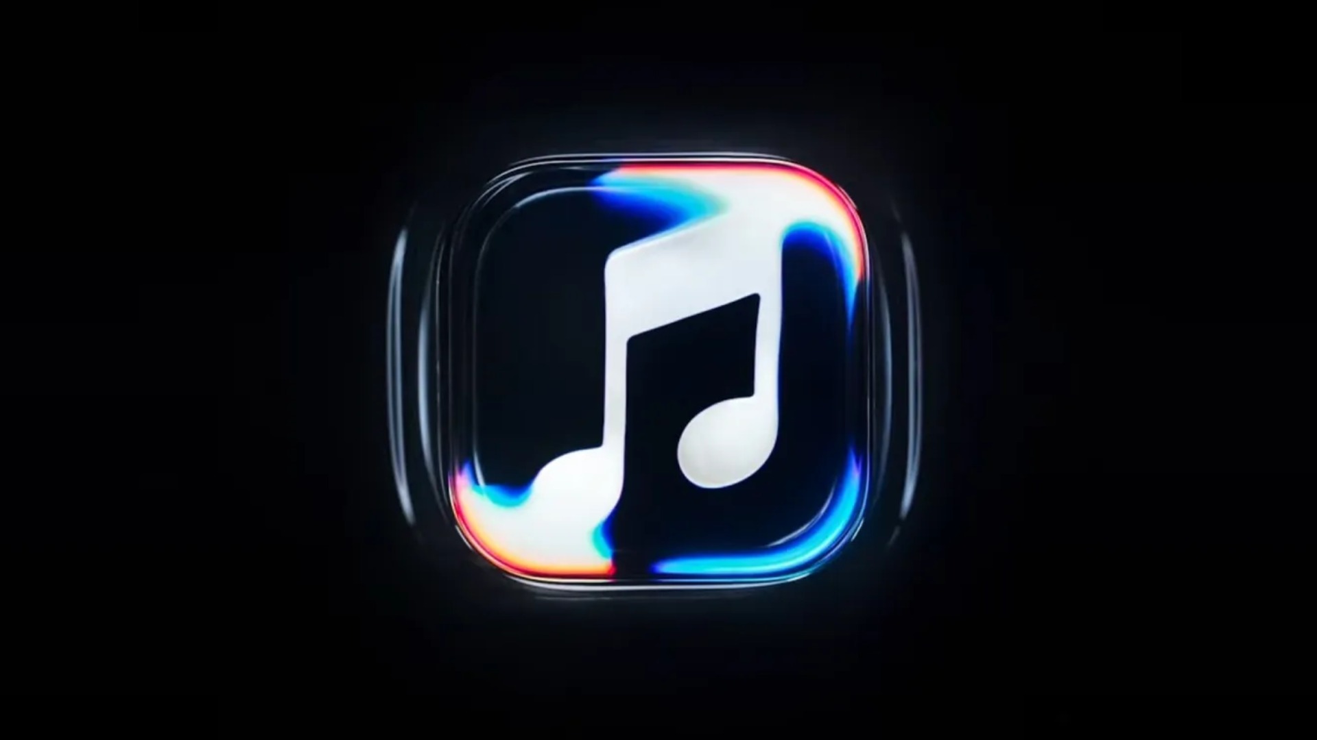
For five weeks, the new Apple Music logo only appeared piecemeal – first at a London concert hall, then in two betas of iOS 27.2. Now Apple has officially unveiled the rebranding and revealed how the logo was created: not on a computer, but from sound waves in a liquid.
Apple Music unveiled its new look on October 21st. The unveiling began with a post from the official Apple Music account on X, accompanied by a making-of video showcasing the creation process. At the heart of the new identity is a custom-composed sound sequence that literally shaped the logo. The bolder lettering had already been seen previously: it appeared as the new logo in the third beta of iOS 27.2.
Key Facts at a Glance
- Apple Music unveiled a new look with a new logo and its own sound signature on October 21st.
- The logo was created from sound: tones set a thin layer of liquid into vibration, and the waves were directly recorded with the camera.
- The project involved British producer Fred again.. and sound design studio NEST Acoustics, implemented with Apple's agency TBWA\Media Arts Lab.
- The lettering combines the Apple logo with a modified, bold lowercase version of the system font SF Pro.
- The new icon will be available on iPhones with iOS 27.2.
How sound shaped the logo
For the rebranding, Fred again.. and NEST Acoustics composed a short piece of music. Individual notes from it were transmitted via a transducer – a component that converts an audio signal into mechanical vibrations – into a shallow tray of liquid. The surface began to move, and the waves and light refractions were filmed, forming the raw material for the new design.
Introducing a new identity for Apple Music, physically shaped by an original composition from @fredagainagain1 and NEST Acoustics. https://t.co/LFXLIfexPL
— Apple Music (@AppleMusic) October 21, 2026
According to the making-of video, the logo was etched into the glass bottom of the tub, covered by a transparent cover in the shape of an app icon. As the liquid swirled, it distorted the view of the logo underneath. Everything was created live on camera, without computer graphics. The video states:
For the rebranding of Apple Music, we wanted the sound to create the images.
Even with the new Apple TV intro featuring music by FINNEAS in November 2025, Apple opted for real-world effects instead of computer graphics. Back then it was colored glass; now it's a moving liquid.
Logo, icon and sound signature
The new font places the Apple logo next to a lowercase "music" in a specially adapted, bold version of SF Pro. The musical note in the icon has also been redesigned; its shape is derived from the filmed waves.
Also new is a sound signature: The composition serves as a brief brand identifier. Apple Music videos will now begin with an animated sequence from the bathtub; concert recordings and similar content will have a simplified version featuring only the musical note. According to Adweek, Apple implemented the rebranding with the agency TBWA\Media Arts Lab. In addition to Apple's own content and events, outdoor advertising is also part of the campaign.
A rebranding in stages
The new look didn't appear overnight, but rather emerged gradually over several weeks:
| Date | Location | What became visible |
|---|---|---|
| 22.09.2026 | Apple Music Hall, London | new lettering as branding for the concert hall |
| 05.10.2026 | iOS 27.2 Beta 3 | new lettering in the system |
| 13.10.2026 | iOS 27.2 Beta 4 | new app icon, blue tab bar, black widgets |
| 19.10.2026 | iOS 27.2 Release Candidate | Release to developers |
| 21.10.2026 | X and YouTube | official presentation including making-of |
The logo first appeared at Apple Music Hall, the new concert venue in London. In the fourth beta, the new black and white app icon followed, replacing the red and pink one. This means the icon was already fully implemented in the system before Apple had even announced the rebranding. With the release candidate of iOS 27.2, the update is now nearing completion.
More than just a new coat of paint
I find the announcement more revealing than the logo itself. Apple revamped Apple Music over five weeks in a fixed sequence – first a physical location, then the operating system, and finally the campaign. This comes across as a meticulously planned brand launch, modeled on the design of Apple TV: real effects, a distinct sound signature, a service that presents itself more as part of Apple than as a separate color brand.
For subscribers, the most noticeable change is the appearance of the home screen. After updating to iOS 27.2, a simple black and white tile replaces the familiar red icon. The new logo doesn't alter the content differences between Apple Music and Spotify. It's the most visible change in a year that has seen many developments at Apple Music, from pricing to the labeling of AI-generated songs.
Do you like the black and white tile, or do you already miss the red icon on your home screen? Let us know in the comments whether the new logo is an improvement for you.