
This article may contain affiliate links. Learn more on our Partner Program page.
First the logo, now the icon: With the fourth beta of iOS 27.2, Apple Music loses its typical red and pink color scheme. Apple is also changing things up in the app itself – with a blue tab bar, black widgets, and a black and white media library.
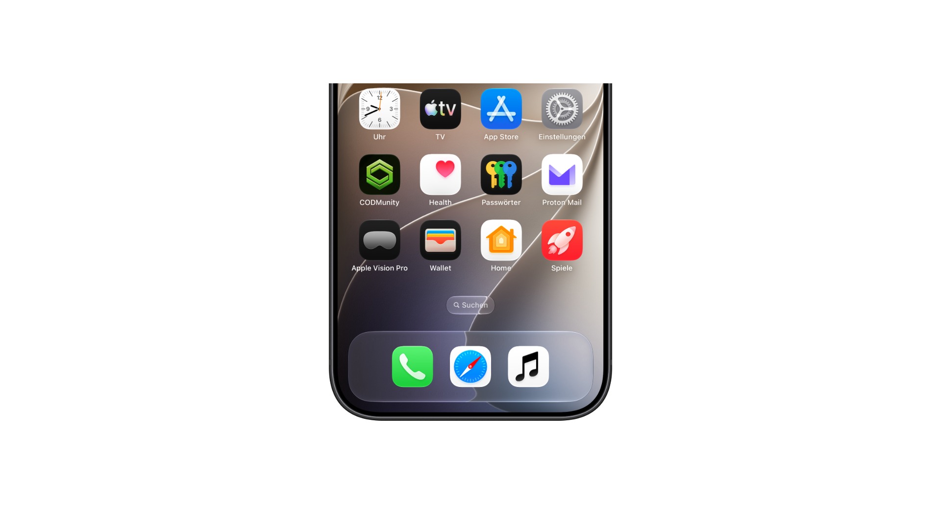
Apple is gradually redesigning the look of its music service. Just over a week ago, a new logo for Apple Music appeared in the third beta version, a logo Apple had previously only used for the Apple Music Hall concert venue in London. With the fourth beta of iOS 27.2, available to developers since October 13, the music app now also has a new app icon.
Not only the icon on the home screen is affected, but also the color scheme within the app. All articles about the upcoming version are compiled on the iOS 27.2 page.
Key Facts at a Glance
- iOS 27.2 Beta 4 brings a new app icon for Apple Music: white with a black logo, in dark mode black with a white logo.
- The active tab in the tab bar of the music app is now blue instead of red-pink.
- The music app's widgets display a simple black background.
- The media library categories lose their color accents and appear in black and white.
- Apple had already incorporated the new logo in the third beta.
Black and white instead of red and pink
The previous Apple Music icon featured a white musical note on a red-pink gradient, making it one of the most colorful icons on the iPhone. The new icon is completely colorless. In the default view, it's white with a black music logo; in dark mode, this is reversed: black background, white logo.
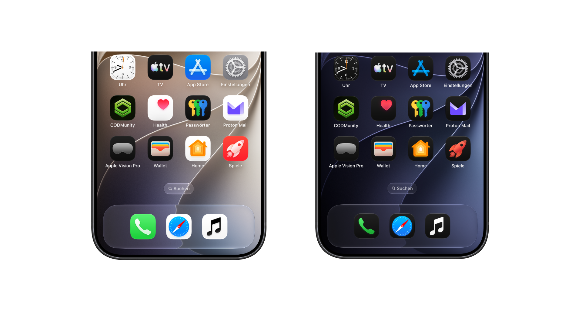
The icon thus adopts the design language of the new wordmark, which places "music" in bold lowercase letters next to the Apple logo. The third beta only changed the wordmark; the symbol on the home screen remained unchanged.
Blue in the tab bar, black for the widgets
Within the app, the new color scheme is most noticeable in the tab bar. The currently active tab is now highlighted in blue – previously it featured the service's red-pink. The music app's widgets also adopt the brand color and use a simple black background.
In the media library, the redesign affects the list of categories used to access playlists, albums, artists, and tracks. The colored accents have disappeared; the list now appears entirely in black and white.
From the concert hall to the operating system
The renovation has now been ongoing for several weeks and involves multiple stages. Initially, it was unclear whether the new logo was intended solely for the concert hall, whose bold typeface it adopts. Later, it appeared in Apple's Instagram clips, which have no connection to the concert hall.
| Time | Location | The change |
|---|---|---|
| September 2026 | Apple Music Hall in London | New lettering visible for the first time |
| October 5, 2026 | iOS 27.2 Beta 3 | New logo in the operating system |
| October 13, 2026 | iOS 27.2 Beta 4 | New app icon, blue tab bar, black widgets, media library in black and white |
Within just over a week, a single text mark has become a consistent visual identity, extending from the home screen to the media library lists.
Apple Music is giving up its signal color
I think this is a bigger step than a new icon would suggest. For years, the red and pink were the hallmarks by which Apple Music could be instantly recognized on the home screen and in every widget. A white icon with a black logo, on the other hand, blends in more with the system icons and is barely noticeable next to colorful apps.
The blue color in the tab bar is also noticeable. It's the color iOS already uses for active controls – making Apple Music look less like its own brand and more like a system component. Anyone who previously found the icon by its color will have to adjust after the update.
The fact that the changes were rolled out gradually in two consecutive betas suggests a planned redesign rather than a test run. I expect the new look and feel to arrive with the final version of iOS 27.2 on all iPhones that support iOS 27.
Would you miss the colored icon, or does the simple black and white one suit your home screen better? Let us know in the comments which version you would keep.